Thursday, 30 November 2017
Teaser
Above is our 30 second teaser for our upcoming video with the single "on our own". This is only a part of the music video to give a taste of what is to come and shows the vibe that can be expected.
Tour Poster

This is our tour poster which shows the dates we will be performing in various locations. We have decided a variety of different places across the country that are easily accessible for all fans from all over, therefore we have chosen our hometown as well as our capital.
Tuesday, 28 November 2017
Friday, 24 November 2017
Digipak Research

As a group we have drawn inspiration from a variety of country artists. We wanted to have western country feel within our digipak with a theme of 'girly pop' throughout; this will be resembled by a colour that we will incorporate through all of our products in the video.
Cover Signatures

This is a photograph taken from an image we have edited to be a promotion piece for our band. We all decided to sign this poster so this could be an idea of future merchandise that we could release. We also think that we could use this as an idea of a product too incorporate within our tour.
Wednesday, 22 November 2017

Tuesday, 21 November 2017
Magazine Final

This is out final magazine cover. We have included a variety of pieces of text which represent what would be involved and spoke about within the magazine article. We decided to incorporate balloons on this too create an element of synergy throughout our products as we have these both in the digipak and the video.
Digipak Drafts

This digipak has been developed over the past week and we have shown both our teachers and peers and received feedback on this.
- Top left image is too squished and looks out of proportion.
- Why are all of them wearing the exact same outfit in each image? If they are in double denim they should wear this in the video as well.
- I like to theme of the balloons and this creates synergy throughout the products.
- The CD looks too artificial.
- Need the writing for the production company on the back with the list of songs.
Friday, 17 November 2017


Thursday, 16 November 2017
Draft of Video
Above shows a draft of our music video and the progress we have made since the halfway evaluation. Since this time, we have had a reshoot incorporating significant props (balloons) within the video to ensure synergy is noticeable throughout the video in conjunction with our promotional work; digipak, poster, magazine. We have also edited a lot of the footage to make it look more crisp and ensured that all of our lip syncing is in time with the music. We still have a lot of progress to make, however we are making a lot of improvement every day.
We have also received feedback from our teacher when she watched this video, she suggested:
- We need to sort out the contrast and brightness with the majority of the shots to ensure they are all equal.
- We need to test out different ways to merge the split screen together (near the end of the video) to make us look less segregated when Renae is singing "sticks and stones".
- We need to go over all of our cuts between each shot to see if we can match them up more significantly with the beat of the song.
- We need to cut out bits of video where the camera jitters EG pip on the tractor.
- Remove the footage of pip walking away from the camera. (2:01)
- Rearrange some of the single shots so that the same person isnt next to eachother after each cut. EG pip walking on the logs and pip in the corn field (1:47)
- Zoom out the shot where Sophie hits the girls on the head.
- Contrast majority of the shots.
- Pan next too the wooden panels is too boring.
- 2:50- lip sync is out.
Final Logo


These are two examples of the logo that we wish to use to promote our brand. We have chosen to use both colours across all promotional work such as the digipak, the magazine and the tour poster. As a result of having our logo analysed by other peers and our teachers, this logo received the most votes as opposed to the guitar and another microphone that was not significant enough.
One feedback comment about the first logo with the guitar was that there was no synergy with the logo in comparison with the video or other aspects of work as we do not include a guitar. On the other hand, the microphone was the best design as we all singers which we link with the rest of the album.
Wednesday, 15 November 2017
Gif Sneak Peek
We decided to do a short gif too post on our social media page; twitter, to give our fans an insight into what will be coming in the video.

Website Feedback
In the video shown is a screen castify undertook by our teacher giving us feedback on our website. She highlighted both positives that are shown in our website, alongside some improvement suggestions that we should take on board to ensure our website is designed to the best it could be.
Tuesday, 14 November 2017
Website Progress
Draft 1

Draft 2

Above shows examples of progress that has been made on the pages within our website. Each page contains the same theme, such as the tour dates, however the aesthetics have been changed to esure synergy is persistent throughout all of our products. We decided to go for the pink theme within the website which links in with our digipak, as well as the pink balloon which is used across all of our products.
Monday, 13 November 2017
Signatures
For our tour poster, we came up with the idea of printing our signatures on the poster, therefore we practised our signatures for the poster on pieces of paper, then wrote on the actual tour poster. We didnt want something too complicated and wanted them to look quite girly to fit our persona of the band.


Saturday, 11 November 2017
What makes a good website?
This presentation gives an overview of what needs to be included within our website to make it achieve all requirements needed. This is too appeal to our target audience, random audiences (in order to attract them) as well as other artists and businesses.
Friday, 10 November 2017
Social Media Promotion Update


Above are the images showing how as a band we are interacting with our fans, ensuring promotion for our music is highlighted and to make sure that all of our music will be known even though we are an upcoming band.
Thursday, 9 November 2017

Wednesday, 8 November 2017
Tuesday, 7 November 2017
Website Research
Research for out website consisted of searching the internet to find some inspiration that we could use within our website. We had a theme in mind and looked at particular artists and bands that are either girl group or link with the country theme.


Websites we looked are are:
http://www.little-mix.com/gb/home
http://www.maddieandtae.com
https://dollyparton.com
https://www.mileycyrus.com
http://www.maddieandtae.com
https://dollyparton.com
https://www.mileycyrus.com
Research we found from the websites we looked at is we will use one prominent colour throughout the website as the background with the text being all one colour which will match the synergy of our website and also as it will be the same for each page with not much change with the font, text colour and background colour. We also found that we will use an a photo of the band to be the background for the homepage which will show off the band to users of the website and so our image as a band can be sown from the outset of the website and users know what kind of group we are.
Little mix is one of the main bands that we have looked at for ideas due to being a group for girls that all have distinctive styles, which is the approach we desire to take with out outfits. We would like to take the idea of the images and the page titles such as biographies on our artists in vanilla, and we would also like to present a picture of the band on the background when users are welcomed.

Maddie and Tae are a duo that are country artists with many different themed music videos, however out most inspiring video we find for theme to have produced is named "girl in a country song" of which many of ideas stemmed from to go a long with the country theme as we liked the aspect of the video as well as their websites and videos.
Location 2 and 3
As for our second location, we went to marsh farm where we filmed in the majority of areas of the farm from the maize maze, to the enclosure with the pigs. We wanted a variety so that our video had a fun aspect as well as seeming professional. We also changed outfits according to our location. For example, for our first outfit we performed on the tractors and with the animals, as for the second outfit, we perfumed in the maize maze where we got a variety of shots, such as birds eye and backwards tracking.
The video shows evidence of us within the Maize Maze.
Friday, 3 November 2017
Thursday, 2 November 2017
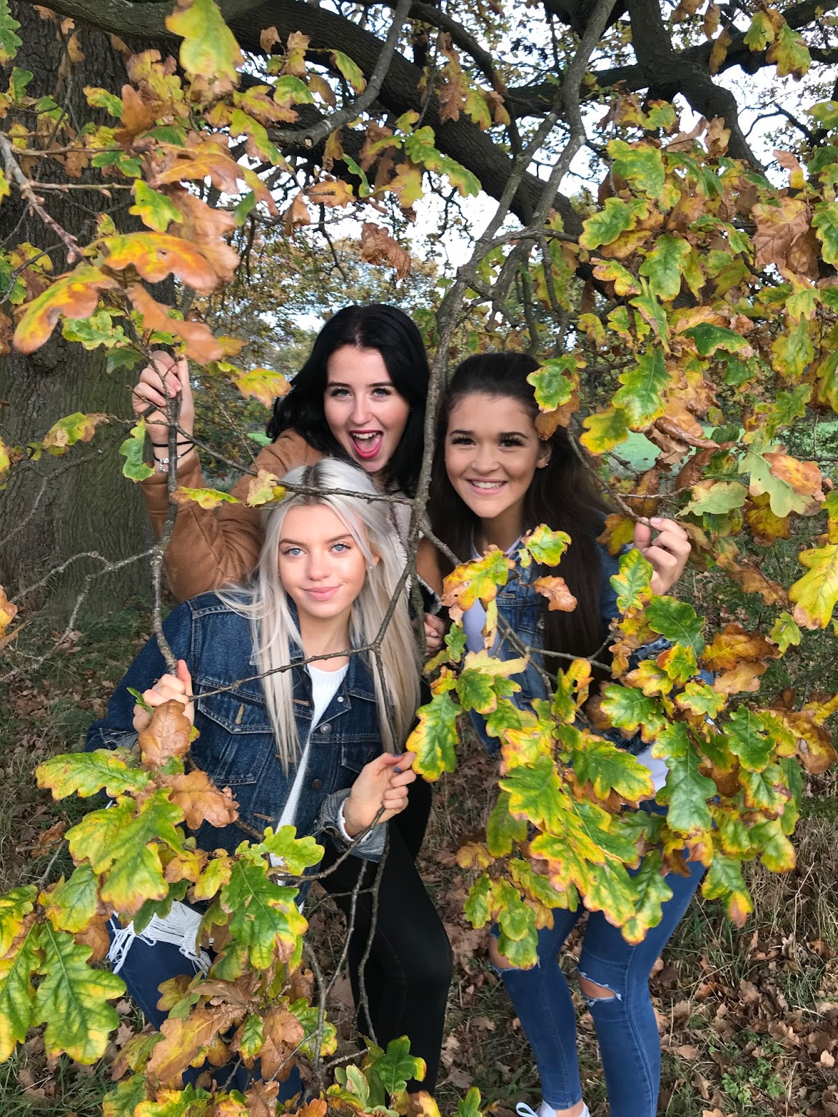
Moodboard

Above is an array of images expressing the type of theme that we would like to portray within out music video. Our country theme enables us to incorporate both pretty and westernised ideas, such as flowers and partially glamorous outfits to hay barrels and old wooden backgrounds.
Subscribe to:
Comments (Atom)
-
 This is the weather forecast for the week we are deciding to film at Marsh Farm.
 -
Album Name: Vanilla Songs: On Our Own Countryside Rough and Tough Lovers Explosion Road to follow Admiration Sight on you 3X3 ...